KanKan
Project
The Project scenario was to find a brand that really could use a character/mascot as a strategic part of their brand.
Year
2022
KanKan
Rationale
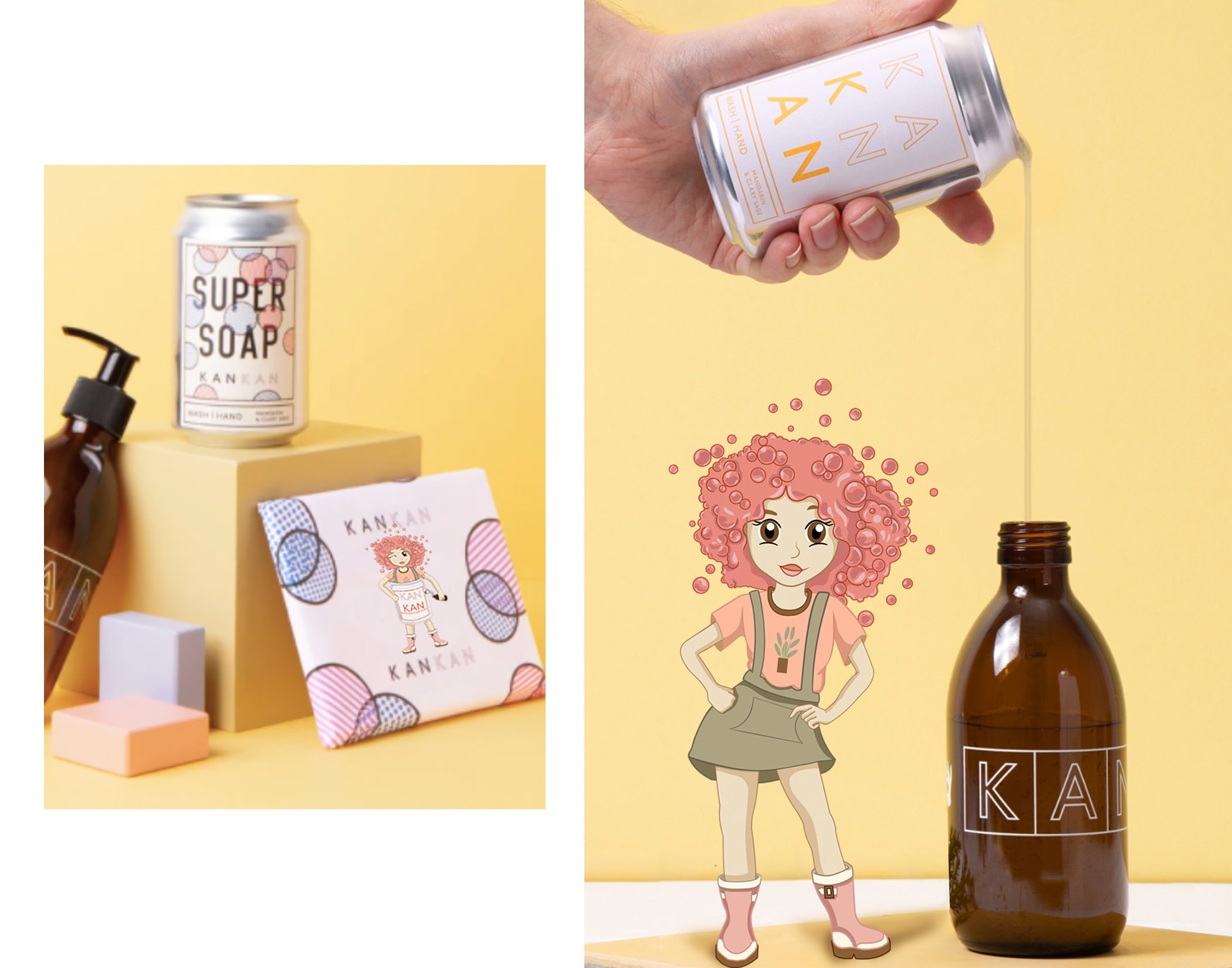
With this illustration, I tried to incorporate the brand's already established look. When reviewing the company's website, I noticed they had established a strong brand identity, so I wanted to incorporate the existing color scheme into the character. I made the characters' appearances resemble those of the brand's founders. When I looked at their photos on the website, I noticed that both founders of this company have a very lighthearted appearance about them. That was something to incorporate into the character's facial expressions.
When I started my sketches, I kept in mind the company's target audience, which would be people who are sustainable and vegan and moms who want a trusted brand for their children. I started to think about what this customer base would like to see; what are they into? People who are sustainable, vegan, prefer natural living, or use natural products would lean more towards a character with a wholesome appearance. Also, understand that this company doesn't just market to adults but also to children. So, it should be attractive to children and young people as well. However, it also needed to maintain a certain sophistication since the website is more sophisticated and clean.
It was important for this character to stand alone and still represent the brand; people still understand and know what this company is about. This is why I chose bubbles for the hair; bubbles represent soap. Children associate bubbles with many positive memories, meaning they would be attracted to this character and, therefore, the brand. The first look you see is that she is wearing a can-like suit with a spout, and she is holding the bottle up to the spout to give consumers and viewers the sense that she's refilling the bottles. If she were a real person, she would need to keep her feet dry as she refills the bottles, so she would need rain boots.
I wanted this character to have two looks because, ideally, if she were posed next to certain things, she wouldn't always need to have the can with her. I liked the idea of her wearing overalls because they are versatile and marketed towards everyone's. Children wear overalls, parents wear overalls, even teens. If this were a real person, they'd probably wear overalls just because they're functional, they have a lot of pockets, and they're also cute in appearance. I placed a tree on the character's T-shirt because the brand plants trees with every bottle purchased. They love giving back to the community, and the character should represent that, which is why she has a tree T-shirt and then keeps the same rain boots as they would be a part of her signature style.


